After reading a post on the HN frontpage from amanvir.com about dithering, I decided to join in on the fun. Here’s my attempt at implementing Atkinson dithering with support for colour palettes and correct linearisation.
Dithering into arbitrary palettes
The linked post from Aman does an excellent job of explaining dithering into a black and white palette using Atkinson Dithering (for a look at techniques like ordered dithering see surma.dev’s great post).
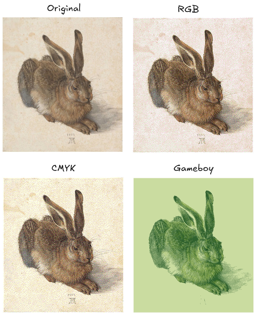
However both of them convert their input images to grayscale before dithering. But why restrict ourselves to monochromatic palettes? Instead of converting the image to grayscale before dithering, we could use any palette!
To dither into black and white, we compare the pixel’s lightness to a threshold. If it’s closer to black, it’s dithered to black and the error is diffused to the surrounding pixels.
If we want to work with colours instead, we will have to account for all three channels (red, green and blue values). Instead of a simple comparison between two scalars, we have to find the closest colour in 3d (colour) space.
First we choose a palette, which should have dark and light values, otherwise the diffused error will grow out of control. For each colour in the chosen palette, the distance to the current pixel’s colour is computed using euclidean distance. See the diagram below for an illustration of this process, using the example of rgb(40, 220, 80).
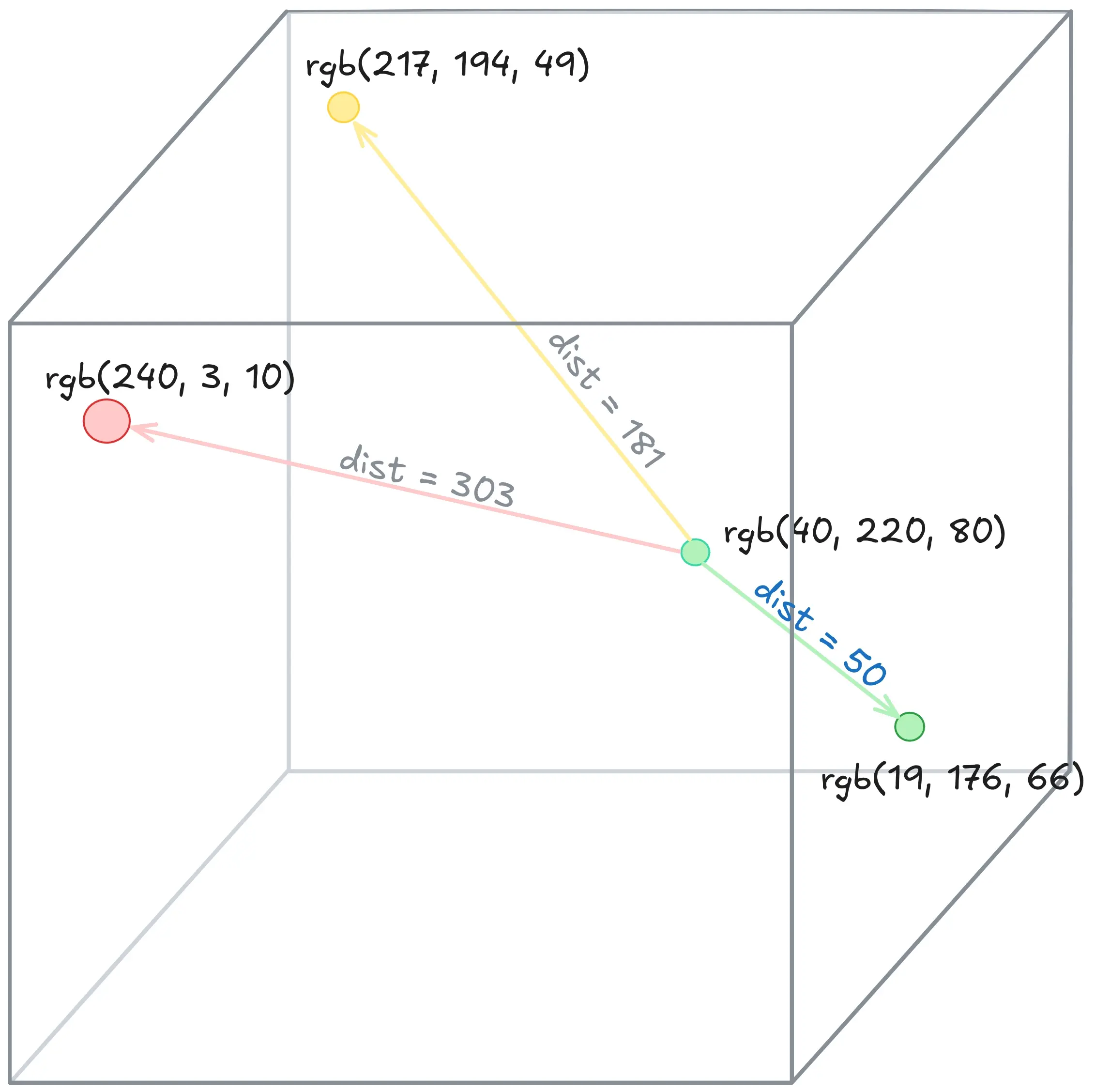
We then diffuse the error for each colour channel individually, similar to what is done in monochrome error diffusion dithering. In the example above, the error would be (4 - 190, 220 - 176, 80 - 66) which results in (21, 44, 12). Thus the next pixels will be slightly lighter, to compensate.
If you want to play with dithering and different palettes yourself, check out ditherit.com, which has a pretty nice web interface.
Linearising
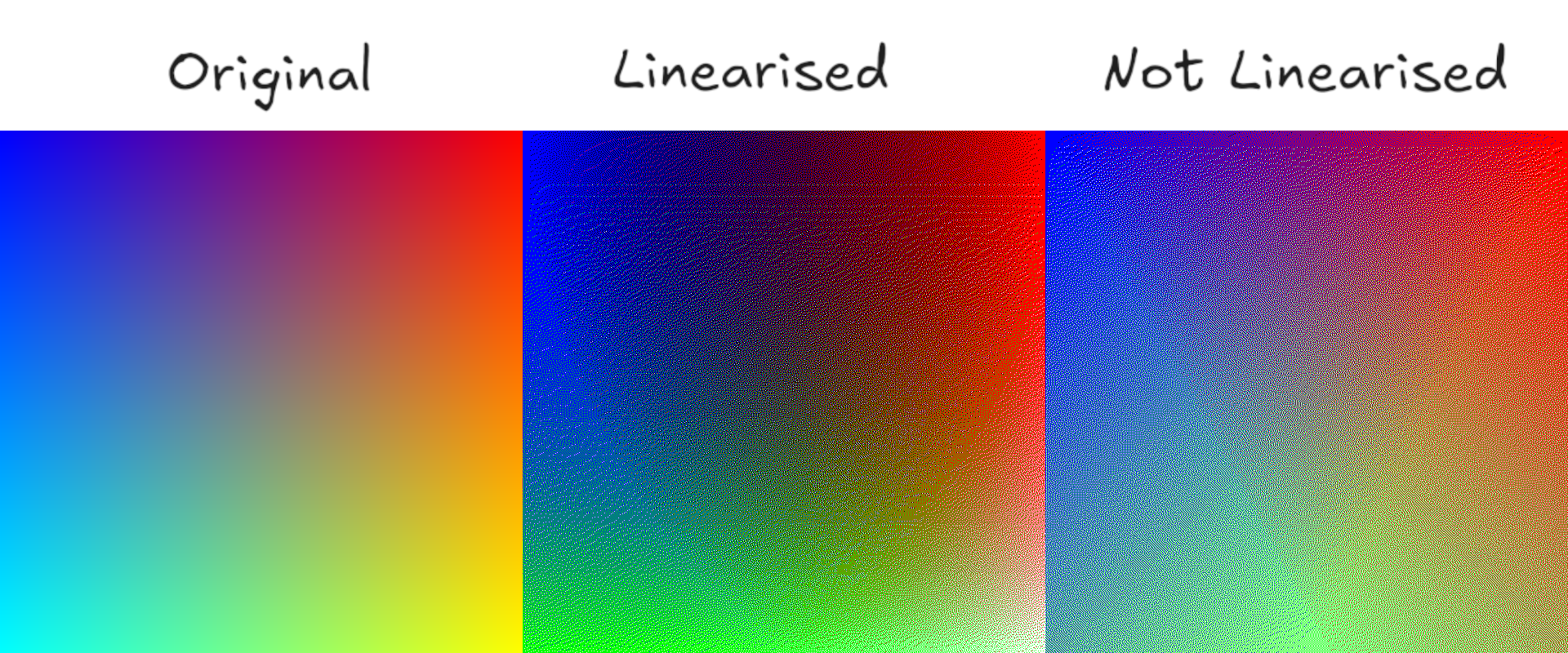
I have just committed a mortal sin of image processing unwittingly. You might not have noticed either, but colour space enthusiasts will be knocking on my door shortly.
First, we failed to linearise the sRGB input image, which results in overly bright dithered outputs. And second, we didn’t take into account human perception: green is perceived brighter than red for example.
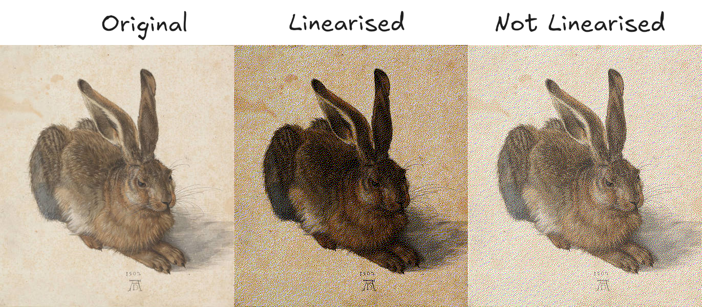
Images are usually stored in the sRGB colour space, which is gamma encoded. An issue arises when we want to quantitatively compare brightness in sRGB. Because it’s not a linear colour space, the difference in brightness going from 10 to 20 is not the same as from 100 to 110, for example.
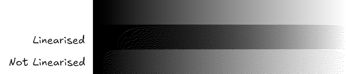
This means that dithering in sRGB directly will produce results that are too bright. Before dithering, we need to linearise the image - convert to a linear colour-space.
Surma explains linearisation pretty well and you should also check out this stackoverflow answer, which is very thorough. This post from John Novak is the best explanation of gamma you can find and I recommend reading it.
If we want to take human perception into account, we need to assign different weights to each channel. By scaling the colours before comparing, we preserve perceptual luminance. The linked Wikipedia post lists the following values: 0.2126 R + 0.7152 G + 0.0722 B.
The two following comparisons should illustrate the kind of errors not linearising produces. If the linearised images look wrong to you, try opening them in full resolution (one pixel of the image should correspond to one pixel on your monitor) on a device with correct sRGB gamma at 2.2.
If you want to play with a correct implementation, there is the dither library and the corresponding command line utility didder from makew0rld. Check out the authors explanation about linearisation on his blog.
If you want to play with my python implementation, check it out on GitHub.
Pitfalls to avoid
Correct luminance when dithering is very important if you want to preserve the image’s original appearance. If you just care about the aesthetic of dithering, feel free to skip it of course. There are a few pitfalls I have discovered while writing this post, and others were helpfully pointed out by various HN commenters. Thank you!
Downsizing or modifying the scale of the image is likely to mess with the dithering, especially scaling down while using anything but linear interpolation. Another factor that might make the results look off is incorrect gamma settings on the monitor used to view the image. Phones are often the worst offenders here, as they combine wrong gamma with small screens and bad downscaling.
Error diffusion and linear colour spaces are tricky. Using an Atkinson dither results in an image that is too dark, as only 6/8th of the error are diffused:
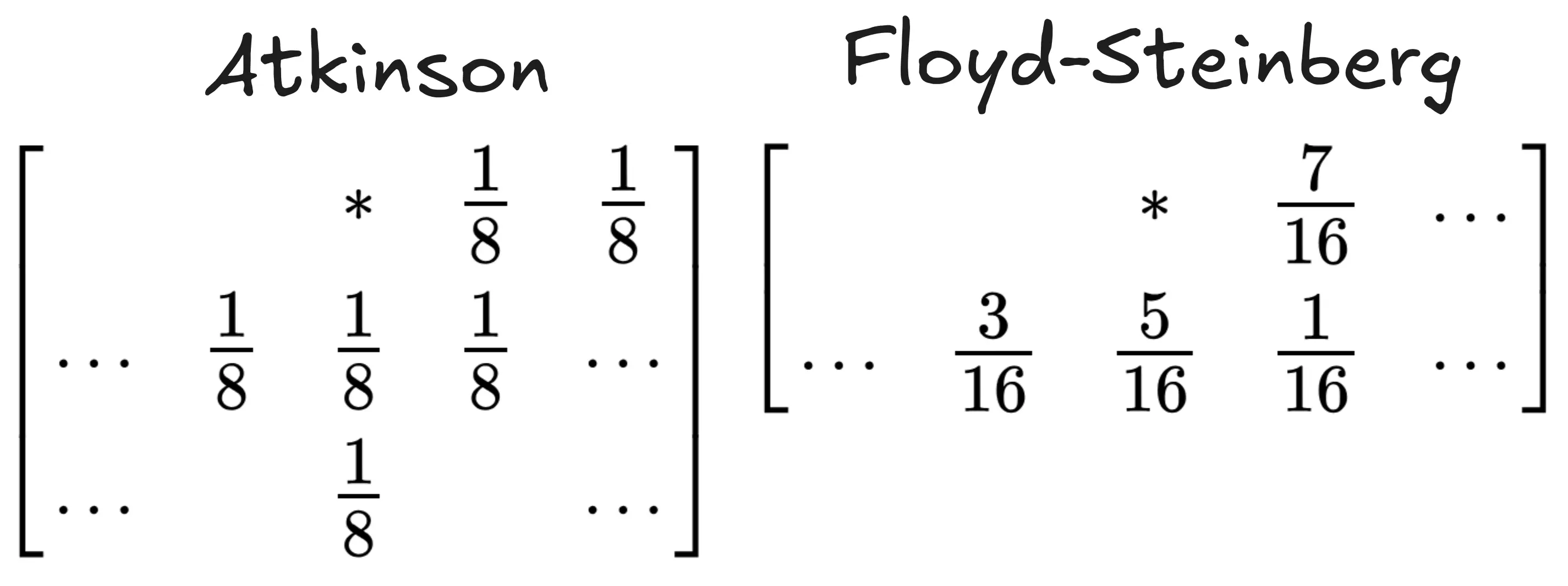
This results in images that appear darker. Floyd-Steinberg on the other hand, fully diffuses the error and doesn’t behave badly. I am not sure if Atkinson considered linearisation while working on his algorithm at Apple, but that’s speculation on my side. Hopefully someone can point me in the right direction here!
Here’s the black and white gradient from before, but comparing Atkinson and Floyd-Steinberg, both in a linearised colour space:
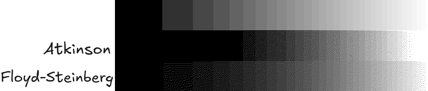
You can clearly see how the missing 2/8th make darker greys disappear.
Dithered images should only be saved as PNGs (or GIFs and other non-compressed formats like .bmp) because compression artefacts will ruin the effect. Thank you Garmelon for pointing out that I previously had enabled automatic conversion to .webp for my blog, which messed with the effects.
TL;DR; Linearise the image’s colour space before dithering, consider perceptual luminance while selecting the closest colour from your palette and apply gamma-correction before exporting the results.
This has become more of a link collection than a post. But I hope that someone finds it helpful to have all resources and a basic explanation in one place… If you know more than me about colours and noticed any errors, please reach out!