I recently bought an RTL-SDR dongle and an antenna to receive ADS-B messages. These are short packets of data, broadcast by every plane in the sky, to inform others of their position, heading, speed and other flight data. The transmission of these messages is mandatory for aircraft, as it prevents mid-air accidents.

They are also unencrypted, which means anyone can listen to them. All you need is an antenna and a dongle to ingest the data on your PC (pictured above), which can be bought for less than 100$. The incoming data can then be processed by software like readsb which decodes the messages.
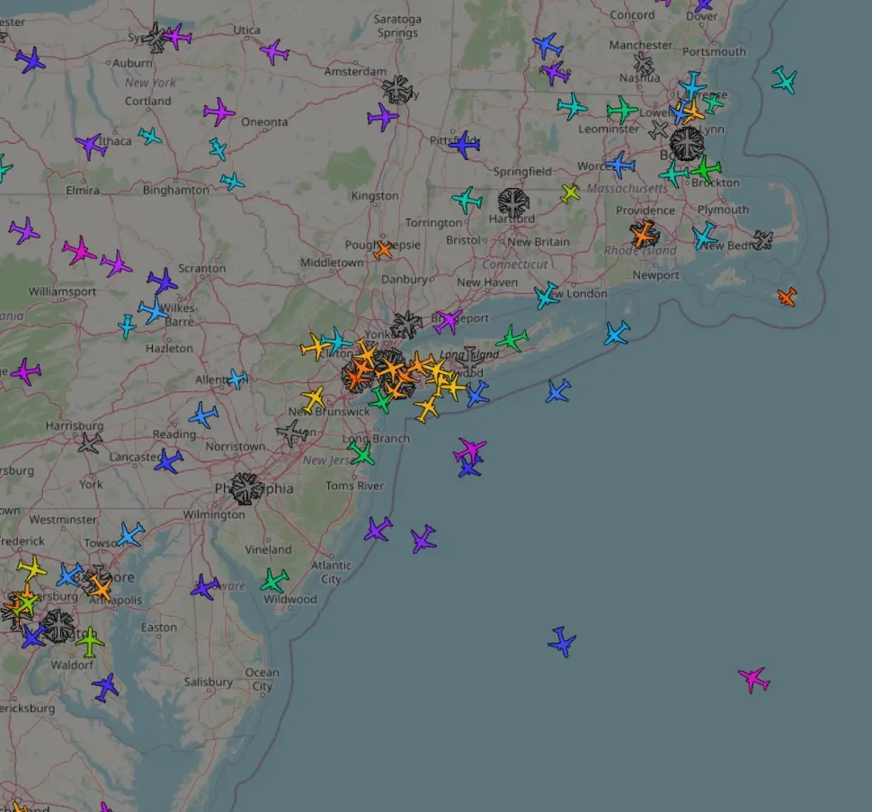
You can choose to broadcast your own data to central servers like the ADS-B Exchange, like many hobbyists do. Thanks to them, we can visualise just about every aircraft currently in the sky. They also provide access to historic data.
One way these massive amounts of data can be used is to make cool visualisation, like Clickhouse did. We’re going to do something a bit different.
How does ADS-B Work
ADS-B messages are (usually) transmitted by a mode S transponder on the frequency 1090 MHz. Pulse position modulation is used to encode these messages as they transmit digital data (If you want to read about analog signal transmission, you can read my recent post on FM radio).
The excellent book “The 1090 Megahertz Riddle” by Junzi Sun goes into a lot of detail about ADS-B and how it works.
Collecting Data
By aggregating and processing the messages about position and heading, we can build a very crude meteorological model! All the work in this blog post is based on this paper (code available at github.com/junzis/meteo-particle-model). See also the paper by Erich Orvitz about a similar system (from HN).
ADS-B messages contain information about both ground speed (measured using a GPS) and airspeed (which is the plane’s speed relative to the surrounding air, measured by on-board sensors).
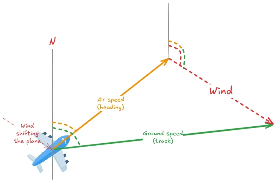
The ADS-B messages also contain the current heading and the track angle of the plane. The heading of the plane is direction the nose points in, while the track is the direction it moves in. These can diverge due to the wind shifting the plane from it’s actual course.
The difference between the vectors formed by (air speed, heading) and (ground speed, track) is the wind vector. By calculating this difference, we can infer wind speed at every point.
By combining this data from thousands of aircraft all over the sky we can build a little wind model that quite accurately simulates real wind conditions.
The paper by Junzi Sun also describes how to extract temperature and pressure from the data sent by the aircraft. By combining this with traditional meteorological models, weather agencies can improve their forecasts.
Building a Model
In order to test out the model, I first had to gather some data. After a quite measly run using my own antenna, I switched to ADS-B Exchange’s historical data. I pulled a total of 1.84 GB covering the 30th of April 2024.
Again, all credit goes to the authors of the paper, I only wrote some plumbing code to wrangle the data into a usable format and added some features to the visualisation for this blog post.
The model places the aircraft on a big grid. For each one, it spawns 300 particles scatter around it, which are initialised with the wind vector calculated for the aircraft. At each step, the particles are updated by a random walk.
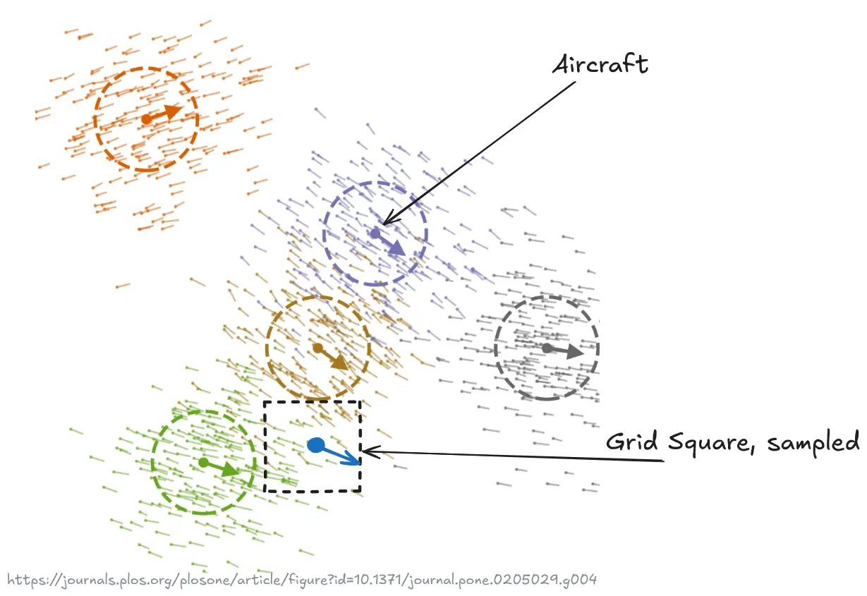
To visualise the wind vectors, we need to measure the speed for each square of the map’s grid. To do this, we sample the particles for each square and take their average velocity vector. The more particles in a square, the higher the accuracy.
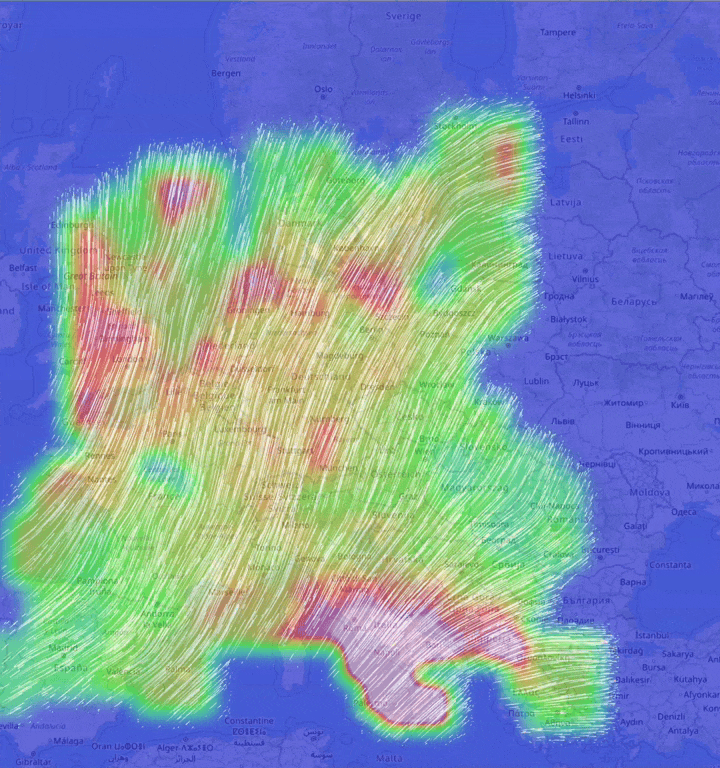
After letting the model run for a while, I got the following GIF - notice the outline of Europe in the background.
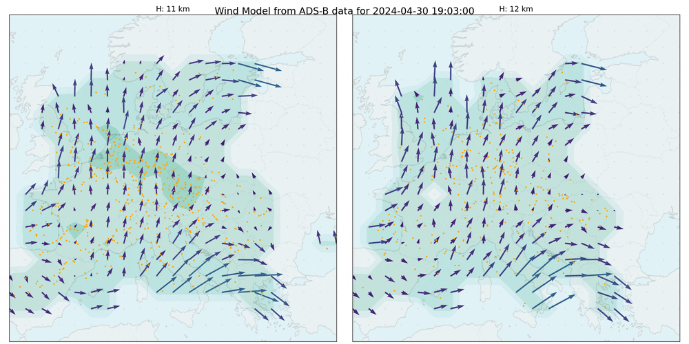
Each frame contains data from about 650 aircraft. The step size of the simulation was set to 15 minutes - which is quite a lot. The density plot visualises the accuracy - more aircraft, higher accuracy. As this is during the night, there is less activity, which results in less data for the model.
How Accurate is the Model?
While the wind vectors certainly do look interesting and somewhat realistic, are they really accurate? To compare the output of the simulation with real wind conditions, I found Cameron Beccario’s earth-wide wind visualisation at earth.nullschool.net.
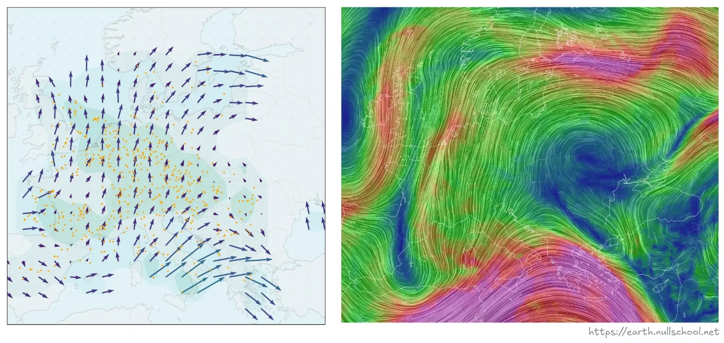
The comparison is not exact, but it’s pretty close. I tried to match up the same countries in both images and the height of the aircraft in my model is about 11km while the data on the right is for 250 hPa (nullschool.net says 250 hPa corresponds to about 10,500m).
You can recognise the same high-speed winds over the Mediterranean (from Greece to Turkey), where the speed even matches up quite closely - our model predicting 50 m/s (180 km/h) and the reference showing 152 km/h.
I’d say that’s a success!